iOS Notifications
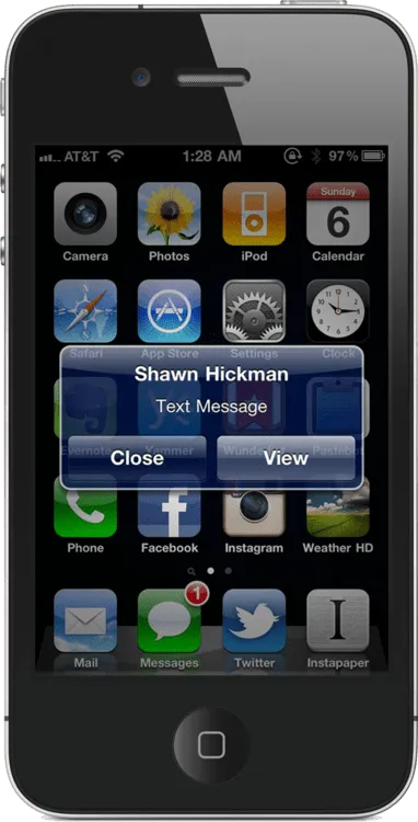
Currently, when I get a text or push notification on my iPhone, it interrupts whatever I’m doing and shows me a dialog box that I must interact with. It’s insanely annoying.
After thinking about how it could be implemented on the iPhone, I think I have come up with something that solves this problem.
Here are some additional thoughts about my decisions:
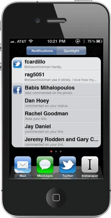
- Spotlight is a cool feature that I rarely use. That space can be used much more effectively.
- Using a small red dot indicating that you have a notification stays out of my way. I can see it, but it doesn’t demand my attention.
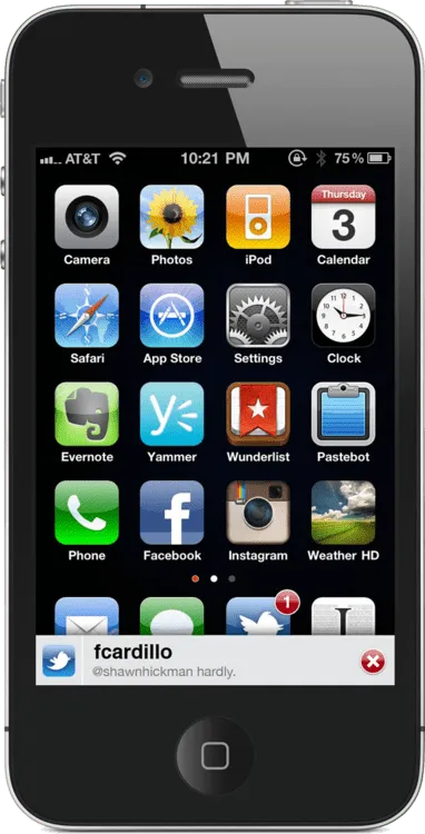
- The bottom of the screen is the best place to have a notification come up. It’s non-intrusive and doesn’t interrupt what I’m doing.
- Pulling a notifications tray from the top of the screen is not the easiest thing to do, unless you have large hands. Managing one on the bottom of the screen is super easy, regardless of hand size.
- I didn’t want to add another icon to the menu bar. It’s already crowded.
- The the slide up notifications are disabled whenever you are using the keyboard. This is to prevent interruption.
This got a nice writeup on Techcrunch.