How to Make Expandable Elements Less Confusing
Expandable elements are extremely common across desktop and mobile apps. So common in fact that you might be wondering why I’m spending time writing about this. Things that are common are not always well understood.
A well-designed expandable element comes down to the placement and rotation of the caret (the little arrow). There is more than one way to do this, but let’s first go over the confusing way to do it.
The Confusing Way to Design an Expandable Element
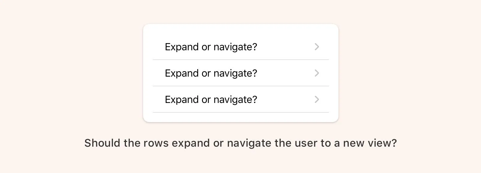
If the caret is placed and pointing to the right you’re going to confuse people. This pattern signifies that upon interaction you will navigate one level deeper in the view hierarchy. If this element expands instead, that will be unexpected behavior. Essentially, you’ll be overloading this pattern with too many meanings.
The Less Confusing Ways to Design an Expandable Element
The first thing you want to decide is where to place the caret. The caret can be placed to the left or right or the expanding element.
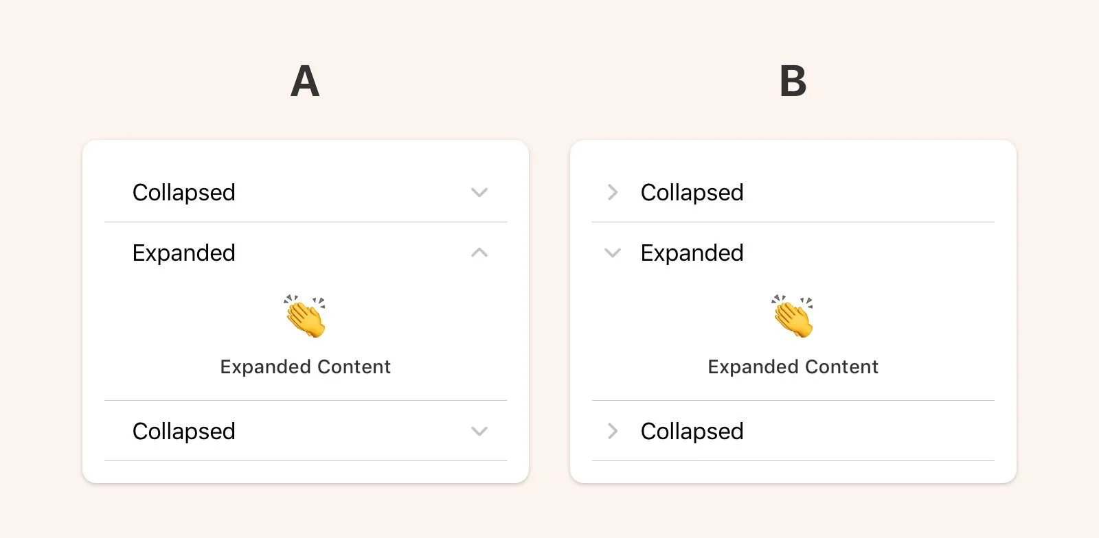
A: Right Side Placement
- Collapsed: Caret should point down
- Expanded: Caret should point up
B: Left Side Placement
- Collapsed: Caret should point down or right
- Expanded: Caret should point up or down
Easy peasy lemon squeezy.